Against the white cube
M3/KG is a polemic delivered at domestic scale. Mount Fuji Architects Studio — the Tokyo practice of Masahiro Harada and Mao Harada, founded in 2004 — framed the house as a response to the “white, flat wall” that modern architecture adopted as a style. In the architects’ account, that abstraction rewards the intellect but does little for the senses, and the house sets out to restore what it suppressed: a sense of mass and material.
The client brief made that argument practical rather than theoretical. The house was designed for a couple in the movie production business — people whose working days are already full of intellectual labour. For them, Harada reasoned, a white-cube interior would read as fatigue rather than calm. A home should soothe the sensory side of its occupants; texture, weight and grain become the means to do it.
“The role of architecture, especially the ones for living, is to soothe the sensory side of people, not to stimulate the intellectual side.”
— Masahiro Harada, Mount Fuji Architects Studio (conference statement, 2006, via Archello)
Two volumes, two kinds of trust
The plan resolves into two distinct structures. An L-shaped block of reinforced concrete holds the rooms that need protection: the bedroom, the kitchen (galley), a gallery and — tellingly for these clients — a film archive. Concrete here is chosen for security as much as for structure, a vault for a working collection as well as a place to sleep.
Against it sits the living room, built not in concrete but as a sequence of box-shaped engineered-wood frames. Where the L is closed and guarded, the frame volume is described by the architects as the house’s open part. The diagram is simple enough to read at a glance in plan: secure things in mass, social life in a lighter, repeated structure. Architectural Record’s Naomi Pollock described the result as a “cavelike dwelling” — a fair summary of how the two parts combine into something sheltering rather than exposed.
A tall room made of thin timber
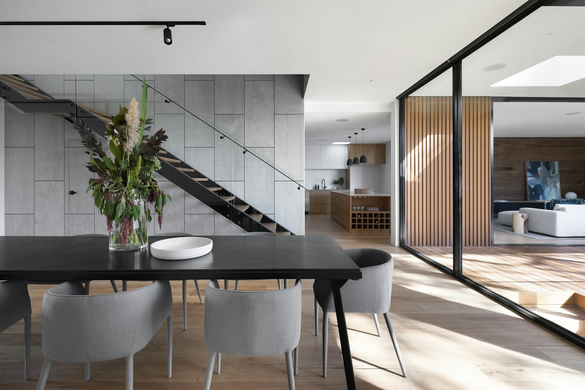
The living space is the house’s defining volume: roughly 6 m high, 5.5 m wide and 14 m deep, according to the architects. Instead of heavy sections, they chose thin engineered-wood members of 38 × 287 mm, repeated as frames along the depth of the room. The effect is less a beam-and-column structure than a rhythm — a ribbed enclosure that gives a double-height space human-scaled increments.
That rhythm also does the work of furnishing. Floor-to-ceiling bookcases line the two-storey living room, so the structure and the clients’ library read together. For a couple whose work revolves around film and archives, the room becomes a kind of reading hall at home: tall enough to feel generous on a compact Tokyo footprint, ordered enough to hold a great deal of material without visual noise. Structural engineering was by Jun Sato Structural Engineers; Eiger Co., Ltd was the contractor.
Texture you can read by hand
Materials are selected for how they feel and age rather than how neutral they look. The concrete was cast so that the wood grain of the plywood formwork remains imprinted on its surface — the board-marked finish is deliberate, not a by-product. Textured stone and iron join it, so that every major surface carries evidence of how it was made.
Read alongside the practice’s other early work — Rainy/Sunny’s saw-toothed concrete, or the self-built plywood XXXX House — M3/KG shows Mount Fuji Architects Studio treating structure and surface as the same decision. For small-scale practitioners, its relevance is less about the Tokyo context than about briefing: the architects translated a client’s working life into a material position, then built the house so that position was legible in every room.
Sources
Research drawn from published project documentation. Photography credits are for attribution only — images on this page are placeholders until rights are cleared.